Research: Personal branding on designer webpages

Establishing and retaining your status as a designer requires solid personal branding. You would expect that most design companies would have a very well designed webpage. Surprisingly often, this is not the case, probably due to a combination of designer culture and lack of communication expertise.

I followed a course in Visual Identity in the autumn of 2011. In my exam project, I moved beyond merely evaluating the visual elements of a selected company’s visual identity, and made a comparative analysis of 39 companies tagged with industrial design in the Danish Design Centre’s database.

First impressions matter:

User experience tests consistently show that web users on average spend 27 seconds on the main page of a website, and that they will simply move on to another website, unless the page achieve four important goals: Tell people what site they have arrived on, what the company can do for them, something about the company, and how to easily move on to the most relevant sections.

Messages have to be ultra lean, only ten to twenty words, because the visitors are spending most of the time figuring out where to go next, rather than reading word for word. Most people won’t scroll (77%) and if they ever come back, they will spend even less time reading your main page.

Pictures: what are they showing?
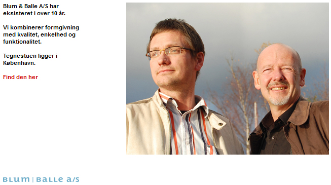
Trustworthy partners at blum-balle.dk

The webpages are very varied, but most of them have a logo, navigation menu, and pictures of designs. Very few had pictures of the designers themselves, which is a bit surprising since the product on offer for an interested production company is actually the designer herself, and her ability to participate in future development projects.

Choosing pictures for the main page is obviously tricky: Design pictures were usually either displayed as minimalistic (one or few pictures), complex (many pictures), hybrid (slideshow), or neutral (no pictures). Each of these options comes with certain risks: selecting one wrong picture, showing too many and too small pictures, a slideshow that changes too fast or too slow, and a page that is just end up boring.

Text: who are they talking to?
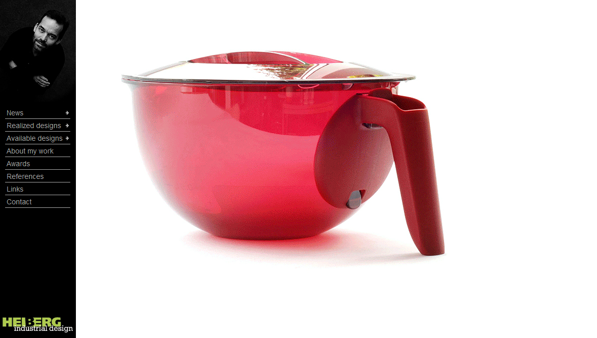
Striking, artsy, and beautiful… but how many has actually been sold? heiberg-id.com

According to Guy Julier, most designers have a secret desire to create “art” and achieve recognition from their peers , by having their design selected for exhibitions, winning design awards, and ultimately having somebody else praise the aesthetic value in books about the history of design. And a fear of being accused of “selling out” by their colleagues if they’re too good at fulfilling their customers need for utility, added value and commercial potential.**
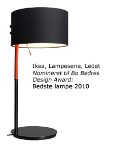
If IKEA is a customer, these designers can sell! halskovdalsgaard.dk

Only a third of the pages had text describing their unique selling proposition: company profile, design philosophy, design examples, or case descriptions. The choice obviously depends on whether they wish to differentiate themselves from competitors based on working method or earlier successes (often backed up with design awards).

However, almost none described why the consumers would benefit from increasing the design content of the products or the commercial performance of earlier designs, which is of obvious importance to interested production companies.
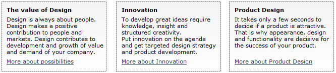
Refreshingly rational arguments from onoe-design.dk

How do you make a good design portfolio webpage?

Designers have different profiles in terms of specialization, experience, level of success, etc. but a few general recommendations can be made:

  • Promote yourself as a designer and attractive partner in development projects.
  • Show the performance of earlier designs in terms of economic and communicative performance of products (e.g. number of products sold, how much free media attention has the design attracted, etc.).
  • Remember that you are not writing to impress your colleague designers. You are writing to businessmen that consider your design as a potential investment of money and your most important priority is to convince them that this investment will pay off.
  • If in doubt, hire a graphics designer and/or communication expert rather than make a webpage that looks unprofessional

Great examples:

* Nielsen, J & Loranger, H  2006: Prioritizing  web usability, chapter 2
** Julier, G. 2000: The culture of design
Research: Is the Danish media even interested in design?

Media attention is crucial for attracting the necessary talent, establishing new designers, and creating a strong home-market that can be used as spring-board for international expansion. Back in May, I made a little investigation of how much and where ‘design’ was mentioned in Danish media. This gave some really interesting insights into design journalism.

Coming from an education in communication, marketing and branding, with special focus on design and fashion, I was obviously interested in knowing where the challenges are for the Danish design field, and where I can help make a difference. Here are some of the most interesting results:

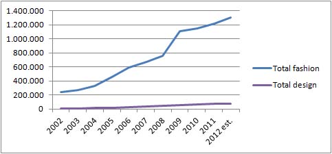
The good news is that there seem to be a dramatic increase in the use of the word ‘design’ from roughly 8500 to 72000 articles over the past ten years. Unfortunately these figures are heavily inflated by large media houses duplicating their content on the web and influenced by structural changes of regional and local press.

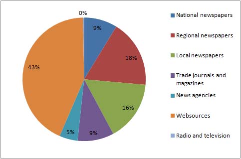
‘Design’ mentioned in the different media types in 2011

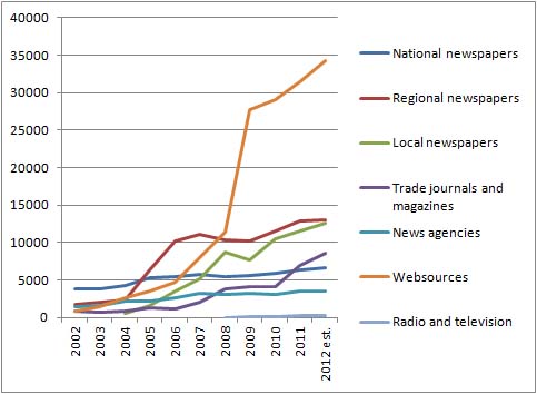
The 43% web content is to a large degree reviews of electronic products from large international cooperations or product reviews recycled in the online versions of various newspapers. This isn’t bad considered as raw media pressure of marketing campaigns, because it increases the chance that the individual consumer is reached, but it doesn’t really tell if there is an increased interest in design from the Danish press.

At the other end of the spectrum are news story summaries from the largest TV and radio stations with less than 1% (212). This is very bad from a branding perspective, because TV is very important for reaching and influencing a wide selection of the population. By comparison, ‘fashion’ is generally growing much faster, and was mentioned more than 24,000 times in TV and radio alone in 2011.

Total mentions of ‘design’ vs ‘fashion’ 2002-2012 (note that ‘design’ is very often mentioned in connection with product reviews and discussions of electronic products from large international cooperations).

‘Design’ broken down to source

Regional and local newspapers have taken a dramatic jump in the past years, which is probably due to two factors:

  1. The merging of provincial newspapers into larger media houses with smaller editorial staffs and reuse of articles across different newspapers.
  2. That lifestyle content is one of the easiest ways to fill pages, because journalists can more or less copy-paste the content from well written press releases supplied by design companies.

A quick read-through of the latest hundred articles for each media type revealed a noticeable work-partition:

  • The news bureaus and national newspapers have a strong international perspective on industrial competitiveness, international design news, events, and product reviews.
  • Regional newspapers are usually either writing about local design companies or new products.
  • Local newspapers focus on new products and local shops.
  • TV and radio is harder to pin down, because Infomedia only follows news programs (not lifestyle programs), which favours more spectacular content that can be presented as “fast news”. What exactly can make design sufficiently news-worthy is of course very interesting, so I’ll look more closely into this in later posts.

So ARE the media interested in design?
Definitely yes, because it help fill pages easily. But it is very problematic that design is mostly treated as either dry business news (company performance, international successes) or lifestyle content that is generally considered slightly corrupt compared to “real” journalism and unworthy for succesful journalists (in Denmark this kind of unfiltered product placement is unofficially called “luderjournalistik” – whore journalism. The equivalent word in English would probably be “churnalism“).

But how do you make good journalists consider design a serious journalistic subject? How can you make them move away from simple fact-reporting: how design “fix” problems and help sell stuff – to actually being interested in the (new) designers, their ideals and the aesthetic value of design to consumers and society?
Here it is probably necessary to switch from a marketing perspective to communication perspective; looking for the good opportunities for storytelling, branding and especially personal branding of the designers themselves.

Facts:

The figures and numbers used in this post comes from a small investigation I made via the Danish media intelligence company Infomedia.dk May 5th 2012, and the estimate for 2012 is roughly calculated as the activity of the first four months x 3.