Typefaces are also brands!

Ok, typefaces can help selling products, but they can also help build a suitable brand personality because people are feeling a lot about these little arbitrary symbol. But how much of this is actually build into the typeface and how much is just because the typeface has achieved a strong brand by itself?

IKEA’s “Verdanagate” crisis is a very interesting example: In 2009 IKEA changed the font on the IKEA Catalogue from Futura to Verdana which created an outrage in typography field. Surprisingly, several mainstream media such as Time Magazine, The Guardian, and New York Times actually picked up the story… ok, considering the fact that three IKEA Catalogues are printed for every Bible each year, perhaps we ought to consider how it influence design appreciation worldwide.

Despite the fact that a lot of attention was paid to the arguments and reactions of typofiles, the story wasn’t newsworthy because of the inherent qualities of Futura and Verdana, but because IKEA’s brand was under direct attack from respected opinion leaders:

  • Co-branding and ideological fit: Both Futura and IKEA design are based on modernist ideals, while Verdana is a typeface created for screen representation by Microsoft, associtating IKEA with the eternal bad guy in IT journalism.
  • Brand heritage: Futura is an old typeface from 1927 that IKEA had been using for 50 years, and even made a sligthly tweaked version (IKEA Sans). Changing the typeface could not only be seen as a betrayal of ideals, but also company traditions and culture. One of the most important aspects of branding from a consumer perspective is trust, because they know what to expect from the company, and because its trademark help them to easily choose products of the desired quality. Shaking up things create doubt and hesitation: if the company start cutting corners on small things like typeface design, what about the products?
  • Exclusivity: IKEA originally switched to Verdana because it’s websafe. Unfortunately, it is also one of the free fonts supplied with MS Word. You can’t diversify your products by using the same typeface as everybody else. The most important aspect of branding from the company’s perspective is the ability to demand a price premium for its products, and being associated with badly written birthday invitations and poorly chosen clip-art doesn’t make things easier.

The Verdanagate crisis shows that typefaces most definitely ought to be considered as separate brands that especially typofiles associate with certain qualities, heritage and feelings. However, the unusualness of the story also shows that typeface isn’t really a concern to the general public. So the heritage and feelings should probably be taken with a grain of salt when talking with the experts.

Half a year later, Futura was actually included among the websafe fonts, but IKEA kept Verdana, and the editing community of Wikipedia decided that the Verdanagate was too non-notable to merit a separate page and moved the content to the IKEA page.

Interesting links:

Plugin for checking typefaces on webpages: http://chengyinliu.com/whatfont.html
Research: Is the Danish media even interested in design?

Media attention is crucial for attracting the necessary talent, establishing new designers, and creating a strong home-market that can be used as spring-board for international expansion. Back in May, I made a little investigation of how much and where ‘design’ was mentioned in Danish media. This gave some really interesting insights into design journalism.

Coming from an education in communication, marketing and branding, with special focus on design and fashion, I was obviously interested in knowing where the challenges are for the Danish design field, and where I can help make a difference. Here are some of the most interesting results:

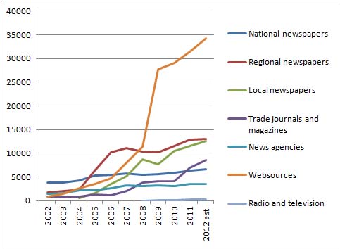
The good news is that there seem to be a dramatic increase in the use of the word ‘design’ from roughly 8500 to 72000 articles over the past ten years. Unfortunately these figures are heavily inflated by large media houses duplicating their content on the web and influenced by structural changes of regional and local press.

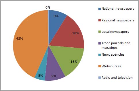
‘Design’ mentioned in the different media types in 2011

The 43% web content is to a large degree reviews of electronic products from large international cooperations or product reviews recycled in the online versions of various newspapers. This isn’t bad considered as raw media pressure of marketing campaigns, because it increases the chance that the individual consumer is reached, but it doesn’t really tell if there is an increased interest in design from the Danish press.

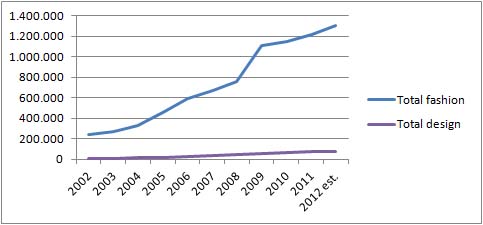
At the other end of the spectrum are news story summaries from the largest TV and radio stations with less than 1% (212). This is very bad from a branding perspective, because TV is very important for reaching and influencing a wide selection of the population. By comparison, ‘fashion’ is generally growing much faster, and was mentioned more than 24,000 times in TV and radio alone in 2011.

Total mentions of ‘design’ vs ‘fashion’ 2002-2012 (note that ‘design’ is very often mentioned in connection with product reviews and discussions of electronic products from large international cooperations).

‘Design’ broken down to source

Regional and local newspapers have taken a dramatic jump in the past years, which is probably due to two factors:

  1. The merging of provincial newspapers into larger media houses with smaller editorial staffs and reuse of articles across different newspapers.
  2. That lifestyle content is one of the easiest ways to fill pages, because journalists can more or less copy-paste the content from well written press releases supplied by design companies.

A quick read-through of the latest hundred articles for each media type revealed a noticeable work-partition:

  • The news bureaus and national newspapers have a strong international perspective on industrial competitiveness, international design news, events, and product reviews.
  • Regional newspapers are usually either writing about local design companies or new products.
  • Local newspapers focus on new products and local shops.
  • TV and radio is harder to pin down, because Infomedia only follows news programs (not lifestyle programs), which favours more spectacular content that can be presented as “fast news”. What exactly can make design sufficiently news-worthy is of course very interesting, so I’ll look more closely into this in later posts.

So ARE the media interested in design?
Definitely yes, because it help fill pages easily. But it is very problematic that design is mostly treated as either dry business news (company performance, international successes) or lifestyle content that is generally considered slightly corrupt compared to “real” journalism and unworthy for succesful journalists (in Denmark this kind of unfiltered product placement is unofficially called “luderjournalistik” – whore journalism. The equivalent word in English would probably be “churnalism“).

But how do you make good journalists consider design a serious journalistic subject? How can you make them move away from simple fact-reporting: how design “fix” problems and help sell stuff – to actually being interested in the (new) designers, their ideals and the aesthetic value of design to consumers and society?
Here it is probably necessary to switch from a marketing perspective to communication perspective; looking for the good opportunities for storytelling, branding and especially personal branding of the designers themselves.

Facts:

The figures and numbers used in this post comes from a small investigation I made via the Danish media intelligence company Infomedia.dk May 5th 2012, and the estimate for 2012 is roughly calculated as the activity of the first four months x 3.