Review: Visual communication from theory to practice

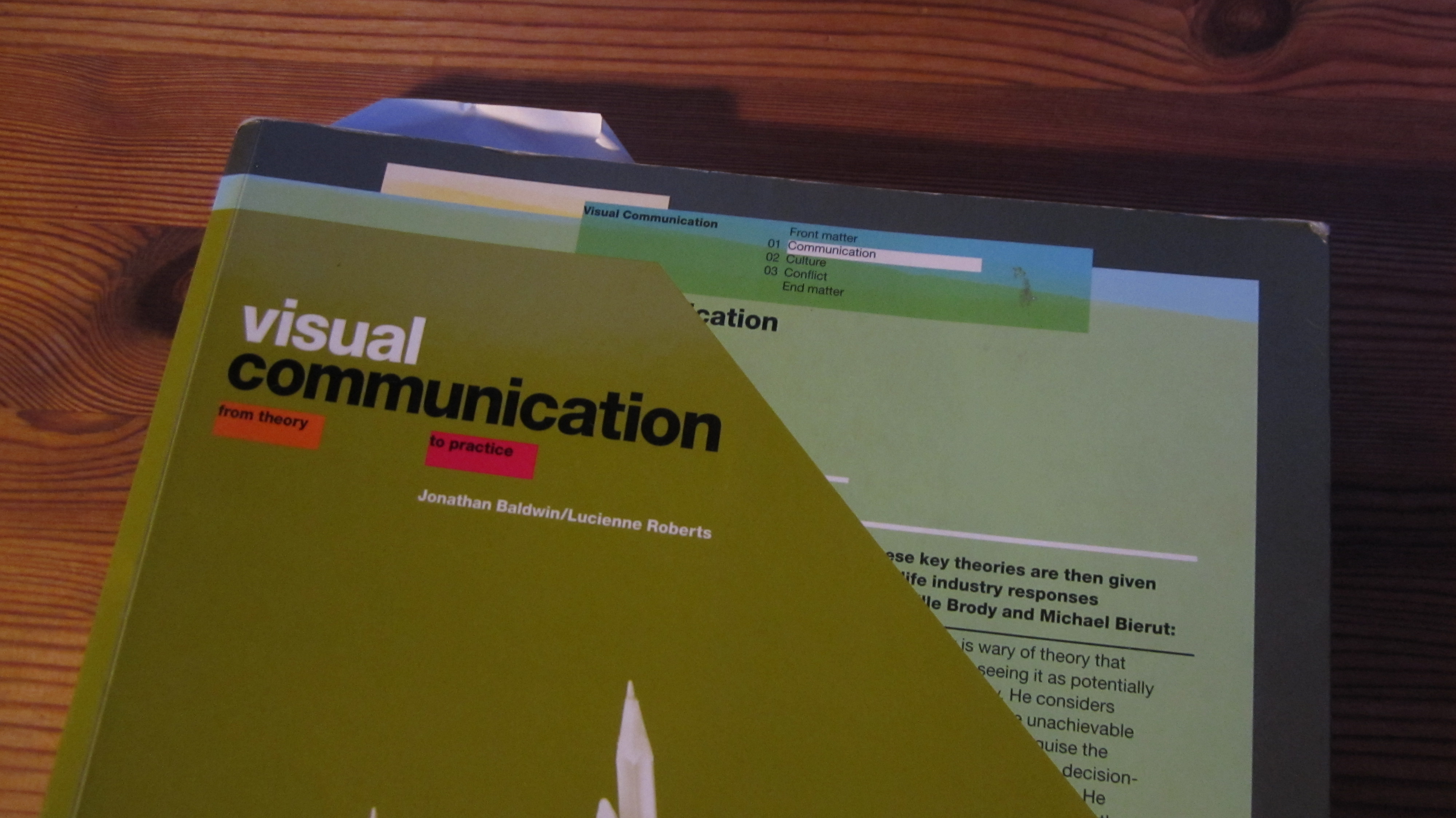
At the moment I’m reading Visual Communication from theory to practice by Baldwin & Roberts. It’s a wonderful mix of communication theories, insightful comments from famous design practitioners, and illustrative examples of graphic design.

I’m seriously considering buying this book for my sofa-table, you should too.

The book is parted up in three sections, each combining a theoretical introduction with comments/application by practitioners, summary:

Design as communication

  • Introduction to Shannon & Weaver’s communication model (yes, very basic, but probably a good starting point for designers), plus semiotics and the construction of meaning (yay!).
  • Neville Brody criticizing the theories as constraining pseudo science and suggesting more personal guidance of students instead of teaching rules.
  • Michael Beirut agreeing that design is essentially communication but that the pseudo science in graphic design is caused by designers knowing too little of the theory and make something up as they go along to rationalize the solutions after the fact.

Design as culture and consumption

  • Segmentation, highbrow/lowbrow culture, popular culture and consumerism, identity creation, appropriation of counter cultures in the fashion cycle, etc.
  • Joan Farrer discussing the UK fashion industry, design process based on heavy market segmentation, economies of scale versus experimentation, and price versus ethics.
  • Shin Azumi & Tomoko Azumi: Democratization of good design via mass production, design process based on functionality and longevity, segmentation leads to mediocre design.

Design as conflict

  • All design is political, handling unethical design-work in a capitalist society, anti-brand movements, the threat from amateur designers, Bourdieu and the construction of the design field.
  • Erik Spiekermann discussing the relationship between designer and customer, public versus private customers, balancing ideals and earning money in a capitalist society,
  • Emmi Salonen wanting to help people through graphic design, criticizing the fight for designer stardom, realization that voluntary and public sectors are still markets, working for money while volunteering on the side as a solution.
Event: Blickfang rethinking design fairs

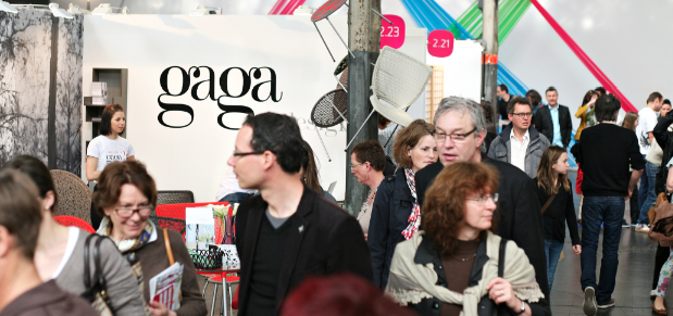
A design fair where you can meet upcoming designers and buy the latest products directly seems like a very interesting attempt at covering the middle ground between professional trade fairs public outlets dumping last year’s products at discounted prices.

Since the conference center Bella Center discontinued its CODE design fair, Copenhagen has lacked an international design fair, and several actors are trying to fill the vacuum: I was originally hired by Exhibition Professionals to work with the DNA Nordic furniture and lighting fair. Unfortunately I only got to write the official press release postponing the fair to 2013, the same year Bella Center will be returning with its new DesignTrade Copenhagen and the biennale Danish Design Week.

Blickfang seem to try to edge in on the gap left by the big players, and with 5500 visitors they have promised to return.

The Blickfang fairs have existed in Germany, Austria and Switzerland for 15 years, combining furniture, home accessories, fashion, and jewellery. According to the international Blickfang webpage, the exhibitors seem to be mainly continental designers, while the Danish PR and marketing material indicate a strong Danish and Nordic presence.

Unfortunately I got sick and couldn’t participate. But from a consumer standpoint, I would really have liked to know the price level: Is this mostly aimed at the affluent and interior designers stocking up on fresh material, or are the prices appealing to a more diverse bargain hunter audience known from regular consumer fairs?

Another interesting question is why the designers decide to participate, and if they were satisfied with the results.

The marketing material promise a mixed audience of young fashion victims and wealthier design fans aged mid 20ties to early 60ties. This gives upcoming designers an opportunity to bypass retail and sell directly to trendsetting consumers, as well as strengthen the (brand) value: Adding the experience of treasure hunting for something unique, the glamour of meeting the actual designer, and knowledge of the thoughts and process behind.

Other benefits are the opportunity to network with other designers, producers, and journalists, as well as getting feedback and inspiration directly from the visitors

Blickfang has not achieved a lot of media attention yet, but was mentioned in Danish Design Association’s newsletter, fashionforum.dk, rumid.dk, eurowoman.dk, and in the home-section of financial newspaper Børsen. More thorough articles can be expected in media partner Eurowoman and RUM magazines.

Fair dates:

  • DesignTrade Copenhagen: August 28th-30th
  • DNA 2013: September 12-15th
  • Blickfang Copenhagen 2013: November 15th-19th

Shooting furniture designers

Fusion by Jonas Pedersen, ready for sale in 2013

Skud pĂĄ stammen” (shoots on the tree trunk) is a Danish four week workshop each summer where designers and cabinetmaker apprentices create brand new furniture prototypes. The experience is obviously very enjoyable and worth-while for the participants, and often result in sellable products that can move the Danish furniture industry forward. But how can the communication and branding effort be taken to the next level?

Solid communication
The webpage and accompanying press release is solid communication, and the story was picked up by the Danish technical journal Ingeniøren. Strangely it wasn’t mentioned in neither Danish Design Centre or Danish Design Association’s newsletters.
The description of how the workshop was executed is rather limited, but this is probably a good idea to avoid competitors copying the concept.
Each participant has been asked 3-4 standard questions, which has resulted in some very good quotes from especially cabinmaker apprentices, while the designers are more brief.

Has the initial communication goals been reached?
Looking at the standard questions, the career counselling aspect is rather obvious: Designers are asked about their educational background (role model), while the apprentices are asked why they wish to become cabinet makers, and dreams for the future.

Both groups are asked why they decided to participate, which indicate that recruitment is (or has been), an important communicative goal. Judging by the replies from apprentices, most have heard about the workshop via word of mouth, and they are already sold to the idea. The designers seem more practical and less enthusiastic when replying to the questions.

So how could the designers be engaged more?
Since the workshop is hosted by Copenhagen Technical College for educational reasons, there is a limit to how many communication ressources can be spent on promoting the designers.
However, it ought to be possible to engage the designers more by making them talk more about themselves: How do you usually work with design (+ link to portfolio page)? How does this workshop influence the way you work as a designer?

Other initiatives could be

  • Extending the promotion by keeping the pages from previous years (it’s a big plus that books from previous years are available on the page, but since you can’t zoom in, it’s impossible to read the text on smaller screens).
  • Assemble design picture, designer and apprentice information in one convenient page, instead of spreading it over three different pages, where you often have to scroll down quite far, looking for a particular designer or apprentice.
  • Newspage spotlighting and following up on designs that have succesfully made it into production and links to external media coverage.
  • Live coverage of the workshop itself (pictures of the process, possibly on Facebook, blogs by designers or apprentices, or communication person walking around asking questions and finding the good stories).

Typefaces are also brands!

Ok, typefaces can help selling products, but they can also help build a suitable brand personality because people are feeling a lot about these little arbitrary symbol. But how much of this is actually build into the typeface and how much is just because the typeface has achieved a strong brand by itself?

IKEA’s “Verdanagate” crisis is a very interesting example: In 2009 IKEA changed the font on the IKEA Catalogue from Futura to Verdana which created an outrage in typography field. Surprisingly, several mainstream media such as Time Magazine, The Guardian, and New York Times actually picked up the story… ok, considering the fact that three IKEA Catalogues are printed for every Bible each year, perhaps we ought to consider how it influence design appreciation worldwide.

Despite the fact that a lot of attention was paid to the arguments and reactions of typofiles, the story wasn’t newsworthy because of the inherent qualities of Futura and Verdana, but because IKEA’s brand was under direct attack from respected opinion leaders:

  • Co-branding and ideological fit: Both Futura and IKEA design are based on modernist ideals, while Verdana is a typeface created for screen representation by Microsoft, associtating IKEA with the eternal bad guy in IT journalism.
  • Brand heritage: Futura is an old typeface from 1927 that IKEA had been using for 50 years, and even made a sligthly tweaked version (IKEA Sans). Changing the typeface could not only be seen as a betrayal of ideals, but also company traditions and culture. One of the most important aspects of branding from a consumer perspective is trust, because they know what to expect from the company, and because its trademark help them to easily choose products of the desired quality. Shaking up things create doubt and hesitation: if the company start cutting corners on small things like typeface design, what about the products?
  • Exclusivity: IKEA originally switched to Verdana because it’s websafe. Unfortunately, it is also one of the free fonts supplied with MS Word. You can’t diversify your products by using the same typeface as everybody else. The most important aspect of branding from the company’s perspective is the ability to demand a price premium for its products, and being associated with badly written birthday invitations and poorly chosen clip-art doesn’t make things easier.

The Verdanagate crisis shows that typefaces most definitely ought to be considered as separate brands that especially typofiles associate with certain qualities, heritage and feelings. However, the unusualness of the story also shows that typeface isn’t really a concern to the general public. So the heritage and feelings should probably be taken with a grain of salt when talking with the experts.

Half a year later, Futura was actually included among the websafe fonts, but IKEA kept Verdana, and the editing community of Wikipedia decided that the Verdanagate was too non-notable to merit a separate page and moved the content to the IKEA page.

Interesting links:

Plugin for checking typefaces on webpages: http://chengyinliu.com/whatfont.html

Why all the fuss about typefaces?

I recently started on “Just my type” by Simon Garfield. It is a very enoyable book about typefaces, and I’m planning to start on a small series of posts on the subject, because this particular part of the design world has been nagging me for a while: Why can people get so angry about Comic Sans, and why can’t you use the powdery frailness of Papyrus without being hit by the chilly winds of dissaproving silence?

First a little provocation:

Because I’m a social constructivist my first reaction is to whip out Bourdieu, arguing that it is completely arbitrary what is considered “good” typefaces and typography. It is just defined as good by people that have achieved a position within the pecking-order of this particular sub-field of design. A sub-field that isn’t fundamentally different from any other nerdy hobby with an established jargon, creative productivity, and an ongoing debate… Except that they have managed to convince the general public that typefaces and typography is somehow more important than other things like designing LEGO spaceships or cosplay costumes?
And one final provocation: Couldn’t we just use something like Helvetica for everything and be done with it?

Personally, I have a tendency to agree with Beatrice Wardes’ Cristal Goblet-argument, that printing should be invisible without disturbing the mental images created by the words of the text. Because my love of writing makes me focus on which emotion, mental images, and insights the words create – instead of how the letters happen to look on the page.
However, typefaces can add something extra to a text, and if you want to sell stuff, everything from content to appearance counts.

This makes typefaces obviously important from an economic standpoint. We live in an industrialized society with participation of labour, where the continuous battle for attention and desire means that everything is being more thoroughly designed from the product itself to visual identity and training of sales personnel.  It’s natural that type designers and graphical designers get their share of this development, and well known companies can often get a surprising amount of media coverage by making slight changes in their visual identity or logo, while a few companies like IKEA has even attracted a lot of critisism by simply changing their standard typeface.

So from a tactical perspective, playing the typeface-game is not only necessary to keep up with competitors, but can also occasionally create attention and brand visbility.
But typefaces is also a lot about feelings, and feelings are very important for developing an attractive brand personality, more on this topic next time!

Danish Design Award 2012

Oticon Intiga, winner of both Danish Design Award Industrial Design B2C and -People’s Choice

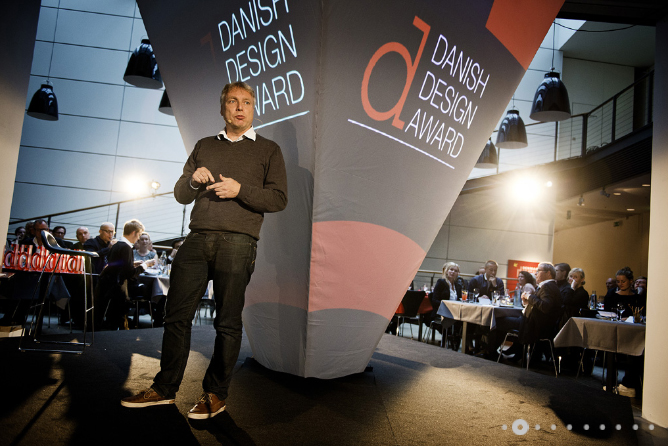
The annual Danish Design Award yesterday introduced two new excellent initiatives: People’s Choice Award and a Talent Award for promising design students. But could the award presentation be turned into a red carpet style media event?

Designers are notoriously bad at getting out there and promote themselves as media personalities, and will generally prefer being picked by a respected curator rather than promoting themselves. The new Talent Award could be a great way to increase media awareness among design students, and give the selected few a starting push toward building their personal brand. That is, if they’re willing to start cooperating with the media.

The People’s Choice Award is another great way to increase awareness of the importance of design and the design industry. The concept is well known from many other types of contests that try to involve the audience more than being mere spectators to the judgement of experts. But success obviously relies on whether anybody is actually voting or paying attention to the results. And that takes media coverage.

Media coverage

Minister of Culture Uffe Elbæk spreading glamour at the award presentation

In line with the little investigation I made of ‘design’ on Infomedia a few posts back, most mainstream newspapers seem to have dutifully reported the results of the design awards (industry news). Judging by the pictures, however, the award presentation seemed like a relatively small and private event in the cafĂ© at Danish Design Centre, and the journalists may not have done much more than rework the story from available press releases.

Judging by an article in the Danish national newspaper Politiken, the shutting down of commercial activities and focus on core business at DDC may have a lot to do with a substantial loss of government funding and a less than sympathetic stakeholder satisfaction analysis.

This makes it doubtful that DDC will be able to lure in the press with a big red carpet style award show in the foreseeable future. But something needs to be done because without genuine press interest, the two other components: designer branding and public participation simply doesn’t work.

Event: Trendspotting in Hong Kong

The other day, I participated in a very interesting conference at Radisson BLU, Copenhagen arranged by Hong Kong Trade Development Council. It was a really nice way to get up to speed with current developments in Hong Kong and China. Here are some of the most interesting points.

The reason for the conference is the creation of a new commercial district in nearby Zhuhai on Mainland China (that will be connected to Hong Kong and Macau with a bridge in a couple of years) and that HKTDC is fishing for foreign investments and representation.

Hong Kong as Asian trendsetter:

Hong Kong is the regional design capital where rich Chinese go to shop. Several design and fashion weeks during the year. 44% of luxury products are Western brands. Free-trade agreement with China applies if a sufficiently large part of the product is created in Hong Kong.

IP protection (by Adrian Toutoungi, Partner, Eversheds LLP):

Hong Kong should be considered the gateway to China for a range of reasons:

  • The legislative system is much more stable and familiar (tradition and language), because it’s based on British Common Law, but applies in Mainland China. In comparison, the Chinese system is very complicated and is regionally divided, which means that you may have to fight the same legal battles across different regions and levels with different results.
  • The current five-year plan aims at establishing China as an innovation- and patent-based economy.
  • The Chinese government has stepped up legislative efforts to protect IP property rights, but is still behind with enforcement.
  • However, if you register your trademark (remember transliterations) with the customs authorities, they will actually take active steps to seize counterfeit products. Depending on your business strategy (brand-based, patent-based, short life cycles, etc.), it might be a good idea to register your trademark as soon as possible even though you are not actually planning on entering the Chinese market. The Danish fashion brand Hummel didn’t and ended up having their legitimate products seized as counterfeit once they started exporting to China, because a Chinese company had registrered their trademark!
  • Pitfalls in the legislative process: If you hire a Chinese or Hong Kong firm to file for patents, they actually owns these unless specified in the contract. Improvements to original designs by local partners are owned by them. Be very aware where your IPs and trademarks are actually valid, for instance it turned out that Apple only had the rights to the name “iPad” in Taiwan not in Mainland China.

Opportunities for Danish design firms (Speaker: Nille Juhl-Sørensen CEO DDC):

  • Hong Kong designers are just as good as Danish designers, but much faster (prototype development in weeks rather than months).
  • We shouldn’t try to sell “Danish” design, but collaborative design, that suits their needs: Small living places calls for minimalism and multi-functionality, and considering a traditional Asian marketplace, the design should probably be loud and visible rather than quiet and discrete to fit the need to show off. Bonus opportunities are to sell the same products to India and other countries with similar luxury consumption patterns.
  • Danish designers should focus on “social design”: Healthcare, social problems, basic needs in rural settings, cleantech. For instance: Why not increase the office temperature in air-conditioned buildings by a couple degrees to reduce cold-shock and energy consumption?
  • Danish designers need to develop an “Asian mindset” but also act as outsiders being able to think out of the box.

A lot of other interesting remarks were made by other speakers from Hong Kong, Kontrapunkt and Danish Chamber of Commerce in South China. At the networking lunch afterwards I had a very nice long chat with Gitte Just CEO of Danish Design Association about Toronto and how to create much more media hype promoting Danish desingers and strengthen public awareness in both domestic and overseas markets.

Research: Personal branding on designer webpages

Establishing and retaining your status as a designer requires solid personal branding. You would expect that most design companies would have a very well designed webpage. Surprisingly often, this is not the case, probably due to a combination of designer culture and lack of communication expertise.

I followed a course in Visual Identity in the autumn of 2011. In my exam project, I moved beyond merely evaluating the visual elements of a selected company’s visual identity, and made a comparative analysis of 39 companies tagged with industrial design in the Danish Design Centre’s database.

First impressions matter:

User experience tests consistently show that web users on average spend 27 seconds on the main page of a website, and that they will simply move on to another website, unless the page achieve four important goals: Tell people what site they have arrived on, what the company can do for them, something about the company, and how to easily move on to the most relevant sections.

Messages have to be ultra lean, only ten to twenty words, because the visitors are spending most of the time figuring out where to go next, rather than reading word for word. Most people won’t scroll (77%) and if they ever come back, they will spend even less time reading your main page.

Pictures: what are they showing?

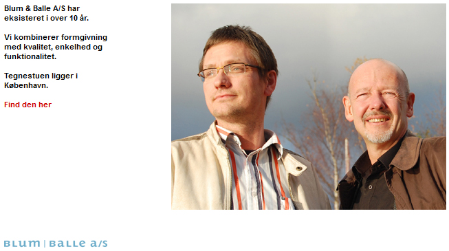
Trustworthy partners at blum-balle.dk

The webpages are very varied, but most of them have a logo, navigation menu, and pictures of designs. Very few had pictures of the designers themselves, which is a bit surprising since the product on offer for an interested production company is actually the designer herself, and her ability to participate in future development projects.

Choosing pictures for the main page is obviously tricky: Design pictures were usually either displayed as minimalistic (one or few pictures), complex (many pictures), hybrid (slideshow), or neutral (no pictures). Each of these options comes with certain risks: selecting one wrong picture, showing too many and too small pictures, a slideshow that changes too fast or too slow, and a page that is just end up boring.

Text: who are they talking to?

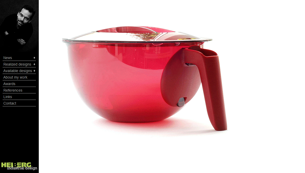
Striking, artsy, and beautiful… but how many has actually been sold? heiberg-id.com

According to Guy Julier, most designers have a secret desire to create “art” and achieve recognition from their peers , by having their design selected for exhibitions, winning design awards, and ultimately having somebody else praise the aesthetic value in books about the history of design. And a fear of being accused of “selling out” by their colleagues if they’re too good at fulfilling their customers need for utility, added value and commercial potential.**

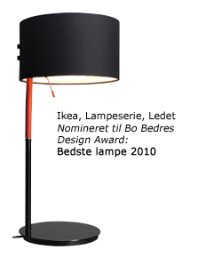
If IKEA is a customer, these designers can sell! halskovdalsgaard.dk

Only a third of the pages had text describing their unique selling proposition: company profile, design philosophy, design examples, or case descriptions. The choice obviously depends on whether they wish to differentiate themselves from competitors based on working method or earlier successes (often backed up with design awards).

However, almost none described why the consumers would benefit from increasing the design content of the products or the commercial performance of earlier designs, which is of obvious importance to interested production companies.

Refreshingly rational arguments from onoe-design.dk

How do you make a good design portfolio webpage?

Designers have different profiles in terms of specialization, experience, level of success, etc. but a few general recommendations can be made:

  • Promote yourself as a designer and attractive partner in development projects.
  • Show the performance of earlier designs in terms of economic and communicative performance of products (e.g. number of products sold, how much free media attention has the design attracted, etc.).
  • Remember that you are not writing to impress your colleague designers. You are writing to businessmen that consider your design as a potential investment of money and your most important priority is to convince them that this investment will pay off.
  • If in doubt, hire a graphics designer and/or communication expert rather than make a webpage that looks unprofessional

Great examples:

* Nielsen, J & Loranger, H  2006: Prioritizing  web usability, chapter 2
** Julier, G. 2000: The culture of design